
Forecasting US Almond Yield
(better than the USDA)

If you are interested in chatting about this type of analysis please get in touch via email here, LinkedIn, or just book a meeting here! Also please consider subscribing to make sure you don’t miss out on any posts!
“The past is never dead. It’s not even past.” - William Faulkner
In a nutshell
US almond yield strongly correlates with previous year's satellite observations.
Leaf development in May-July is crucial for next year's crop yield.
My linear regression model:
Uses just one feature: green band reflectance from previous June
Outperforms survey-based USDA forecast: 67% vs 39% variance explained
Beats USDA forecast 56.2% of the time between 2009 - 2024
Limitations: Doesn't account for current-year weather events or other factors, is fit to very little data.
Takeaway: Free satellite data is powerful for agricultural forecasting, especially for tree crops.
TLDR; Almond yield in a given year correlates very well with satellite observations aggregated from the previous year.
Read on to learn more!
The Cropland Data Layer
The Cropland Data Layer (CDL) is a geo-referenced, crop-specific land cover data layer created annually by the U.S. Department of Agriculture's National Agricultural Statistics Service (USDA-NASS). It provides detailed information on crop types and land cover across the contiguous United States, and is in my opinion one of the wonders of the modern world, and it’s free!
The CDL is produced using satellite imagery from various sources, including Landsat 8/9 OLI/TIRS, Sentinel-2 etc... These images are collected throughout the growing season and combined with ground truth data, which includes farmer-reported information and field observations.
To create the CDL, NASS employs supervised classification techniques, primarily using decision tree algorithms. This process categorizes each 30-meter pixel into one of more than 100 crop and land cover classes. The resulting product offers a high-resolution, spatially explicit representation of agricultural landscapes, which is invaluable for various applications, including crop yield prediction and monitoring.
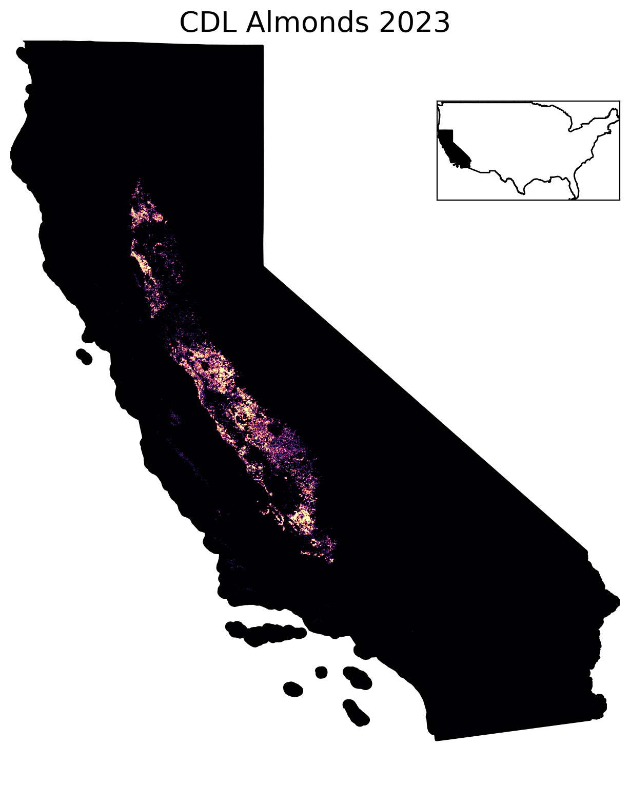
We’ll be using the almond layer from the CDL specifically for this investigation, shown in the image above. To literally no one’s surprise: this layer indicates that pretty much all the almonds in the US are grown in California. According to the USDA: you’re looking at 80% of the global supply of almonds in that image.
Extracting Features
Now that we have an almond layer let’s look at how to extract relevant information over it by using it as a mask: we’ll take whatever input data we’re interested in , data from the Moderate Resolution Imaging Spectroradiometer (MODIS) in this case, mask it using the almond layer, and extract values specifically over this mask.
I find MODIS to be a great sensor to use for studying agriculture in many cases due to it’s daily revisit rate, which often allows you to pick out pretty detailed information concerning crop phenology. Although the pixels tend to be ~500m x 500m, so pretty large compared to Landsat or Sentinel pixels, this tends to be sufficient for many agricultural applications unless one is specifically interested in smallholder agriculture.
This process is shown below: here we’re showing a MODIS RGB composite captured over February 2024. Finally we’ll calculate summary statistics that we hope capture information relevant information concerning the distribution of pixel values for each band over the almond mask. In this case I’m showing the median.

This process of masking and reducing remote sensing data temporally and spatially enables us to effectively summarize the behavior of a given crop into a simple set of numbers: here we’ve reduced information on the characteristics of almonds in California in February of 2024 to a set of three numbers: [753, 809, 391]. By comparing these sets of numbers to other times in the year, or other years, we may be able to glean some information about the state of the crop.
By now, the foundation model aficionados among you will be noticing a distinct similarity between this process I’m describing and the process of embedding data. I would argue that it is not really that different. We are just using a simpler embedding model (calculating the median over time and space). Perhaps the real foundation models were the satellites we launched along the way.
Vegetation Indices
In the previous section we used RGB imagery as an example, but many of the sensors we can use are multispectral, which means they image in spectral bands beyond the visible/RGB bands. Vegetation indices are mathematical combinations of spectral bands that highlight vegetation properties in remote sensing data. They exploit the unique spectral signatures of plants, particularly their high reflectance in near-infrared (NIR) and low reflectance in red wavelengths. Here are some common vegetation indices that we’ll use to examine our almonds:
Normalized Difference Vegetation Index (NDVI): NDVI is widely used to assess vegetation health and density.
Where G, C1, C2, and L are empirically derived coefficients. Enhanced Vegetation Index (EVI): EVI improves upon NDVI by correcting for soil background signals and atmospheric influences.
Green Chlorophyll Index (GCI): GCI is sensitive to leaf chlorophyll content.
Normalized Difference Water Index (NDWI): NDWI is used to detect water content in vegetation and monitor drought stress.
Where L is a soil brightness correction factor: Soil Adjusted Vegetation Index (SAVI): SAVI minimizes soil brightness influences in areas with low vegetation cover.
Using our mask we can pull these indices over almond for all years where almond data is available in the CDL, 2008 - 2023 and spatially reduce over the mask using a median reducer: we can see the phenological cycle of the almond trees year over year: cycles of high vegetation index (VI ) and lower VI corresponding to various phases in the growth cycle of almond trees.

Correlations with Yield
We can pluck the almond yield figures from USDA-NASS reports such as this one, here’s what they look like. We see there’s quite a lot of variability year over year, with 2023 being the worst year in our dataset!

Now we’ve established how to extract almond-related vegetation signals and our yield data, let’s reduce everything over the time dimension to a monthly sampling rate.
This process is shown in the figure below, so for each year/band combination we end up with 12 numbers which represent the values of that band resampled at a monthly rate for a given year

An important thing to note about almond trees is that the first stage after dormancy in the winter is actually the bloom in February - March, followed by nut formation and leaf development/nut maturation over the summer, with harvest in late summer/fall. This is shown in the Figure above.
If we look at pictures of the almond bloom we’ll see the trees have no leaves yet:

In fact, only when we look at post-bloom, from April onwards, can we see leaves on the trees. During this phase the nuts are maturing and growing in size on the tree. This is also typically when irrigation starts.

I generated a video of Sentinel-2 RGB composites showing February vs June for the year 2024. You can see the transition from bloom (purple/pink pixels) to leaf and nut development, when the pixels turn green.
Now that we have our monthly features and our yield data, let’s take a look at correlations between MODIS reflectances and final yield. We’ll also include raw band reflectances. These are all actually pretty disappointing: our greatest correlations appear to occur in December, way after harvest.

Given that we only have 15 data points (2009 - 2024) to fit a model with, we’d ideally want some higher correlated features. After all, it might only make sense to choose one or two features to avoid overfitting.
However, we’re forgetting one crucial thing here: tree crops are very different to row crops! They accumulate resources via soil, water and photosynthesis on different timescales to say corn or soybean. We also know that the almond bloom, the density of which determines how many nuts will be produced, occurs right after dormancy. So perhaps it also makes sense to check correlations between features from the previous year and yield: low and behold, we see extremely high correlations (up to 0.86) between our MODIS features from the previous year, and yield in the ‘current’ year.
Not only that, but our high correlation features seem generally clustered around the same months, May, June and July.

Let’s take a closer look at what some of these correlations look like: in each of these plots the _x suffix represents the month, so Green_06 represents the median green MODIS band (545-565nm) collected over almonds in June etc…

Let’s parse through these results a little: first we see high positive correlations between most of our previous year vegetation indices and yield. We know that the May/June/July period is when leaf development tends to happen: NDVI, GCI, EVI and SAVI can all be considered approximate measures of leaf density. The strong positive correlation for those features tell us that leaf development in the year prior to harvest strongly determines yield!
This is confirmed by some pretty cool empirical studies that show previous year leaf area correlates positively with the next year’s flower density AND next year’s fruit density. So there you have it: using remote sensing we can show that this relationship holds at scale, over the entirety of the almond growing land in California.
This is a good time in the article to stop reading for a bit and ponder how truly magical it is that we’re even able to do things like this, using freely available data.

Yield Prediction
Now that we’ve found some nicely correlated features, let’s predict/forecast yield! While the exercise of fitting a model 15 data points using hundreds of features is not necessarily an interesting one, it is good to know how well we can forecast overall almond yield using remote sensing. Specifically, some people may be interested in how one of our models might perform relative to the USDA, which is typically released in May of the harvest year.
We’ll pick the best feature, the green band (Green_06) from June of the previous year, and fit a linear regression between the band reflectance values and the yield. We’ll validate by performing leave-a-year-out cross validation. This is technically a little generous, and not true time-series CV, but we only have 15 data points, and since this is my blog post I get to decide the rules.

We see that on average we are off by 4.42% from the true value of yield, a year ahead since we are using the previous years reflectance data. We’re also explain about 67% of the variance in our data, which is pretty good considering we can perform this prediction a year ahead of time, using a single feature. This actually tends to outperform the USDA forecast over the same period, which explains 39% of the variance in almond yield between 2009 - 2024. Predictions vs true yield shown below:

While the single feature linear regression forecast outperforms the USDA forecast, it’s also useful to have a look at the model’s win rate: sometimes these average metrics can be dominated by a single wonky year where the predictions are off by a lot. The image below shows our predicted yield vs the USDA forecast, with the actual yield reported as a green line, as well as our win rate. The linear regression model is closer to the true value 56.2% relative to the USDA forecast of the time in our time period. Again, because we only have 15 data points we should be wary of reading too much into these results, but these are pretty encouraging results.

Discussion
You might be wondering why I’m not off making millions trading almond futures at this point. Aside from the fact these don’t exist (as far as I’m aware), yield is just one part of the picture when it comes to modeling supply or price. I should also note that the USDA forecast is really good, and only has a mean average percentage error (MAPE) of 6%, which is pretty incredible in of itself!
Another reason is that there is still a whopping 33% variance in the data still needing to be explained. Trees/crops are pretty complex and I don’t truly believe we can just ignore current year features when it comes to predicting almond yield and only use features from the previous year. Extreme weather events during crucial phases such as a frost during the bloom phase of the harvest year could easily disrupt this type of year ahead prediction. This model should be used more as a baseline from which to incorporate more current events we believe are relevant to almond yield. In an ideal world, we would would find a clever way to harmonize the results from the USDA survey with satellite observations.
There are also many other datasets we haven’t explored here including weather, remotely-sensed land surface temperature (LST) as well as evapotranspiration (ET), which could help us improve our model. However, we are still fundamentally constrained by the size of our dataset: simply including more features in modeling exercises can lead to improved performance, but at the cost of interpretability. Overfitting also tends to be a genuine concern in these situations too, and without interpretability we’re unable to derive insights such as the one relating previous year leaf spur area to yield.
Ultimately, when it comes to modeling it’s up to the user and the stakeholder/clients to decide whether they are comfortable sacrificing interpretability for increases in performance, at the risk of overfitting.
However, hopefully this post has still convinced you of the value of earth observation data in solving agricultural problems. Personally I think remote sensing is still underutilized when it comes to agriculture, and am hoping to demonstrate more applications through this substack, so please subscribe if you enjoyed the article!
All of the geospatial manipulations in this blog were performed using Google Earth Engine (GEE). I personally consider GEE to be the 8th wonder of the world: it provides unparalleled access to geospatial data and enables analysis like the one I’ve just showed.
Get in Touch!
And again: If you are interested in replicating this type of analysis for different crops or regions, or just generally chatting about geospatial analysis please get in touch via email here, LinkedIn, or just book a meeting here to chat!
If you enjoyed this article please consider subscribing:
So good! I learned a lot. Thanks for sharing your thought process. Maybe there's a blog post about useful GEE scripts you've used?
"in a nutshell" <3