If you are interested in chatting about this type of analysis please get in touch via email here, LinkedIn, or just book a meeting here! Also please consider subscribing to make sure you don’t miss out on any posts!
“Light is a thing that cannot be reproduced, but must be represented by something else – by color.”- Paul Cézanne
I show how to perform anomaly detection on a sample hyperspectral image taken over the Suez Canal in Egypt: you can explore the results using this colab notebook, but you’ll need to first make a Google Earth Engine account if you don’t have one.
The anomaly detector reveals lakes, roads, and interesting buildings in the area, but in an operational setting we’d need to dig into these anomalies further to draw insights.
In future posts we’ll explore how to make these results actionable, as well as how to perform change detection using Wyvern’s data!
🐲 Wyvern’s open data program
Wyvern, a hyperspectral imagery provider based in Canada, recently launched an Open Data Program providing free hyperspectral satellite images to the earth observation community. As far as I’m aware this is the first free, open, commercial hyperspectral dataset. Now some geospatial curmudgeons, including myself, might raise an eyebrow at the claim that 20 - 30 bands with ~20-30 nm full-width at half maxima (FWHM) is ‘hyperspectral’. Then again, those curmudgeons should feel free to provide their own truly hyperspectral data for free to the EO community so we can compare. Since I don’t have my own satellite (yet), I’m not going to complain about free data. Additionally, it seems the industry is still figuring out exactly what hyperspectral means. Personally I think the bar should be that at least one member of your data science team has cried while manually post processing matched-filter false positives.
Accessing the data
Something I was very pleasantly surprised by is the amount of effort Wyvern has put into documentation and code examples. They have an extremely nifty knowledge center/centre which provides not only geospatial and hyperspectral basics, but also a very handy guide on image processing levels. Amazingly, Wyvern also provides code examples/jupyter notebooks on how to access their data, and how to perform top-of-atmosphere (TOA) processing.
Since the data is delivered as Level-1B (L1B) processing level: each pixel represents at-sensor radiance, rather than a direct measure of the surface’s properties. Radiance values recorded by the sensor will depend on factors such as solar angle, Earth-Sun distance and atmospheric conditions. Processing this data from radiance to reflectance, normalizes the pixel data by accounting for the amount of incoming solar energy. Here’s an example of the effect this can have on a spectral profile taken from wyvern’s notebook:
I used the code provided by Wyvern to perform this process, with the results shown in the RGB composite below. You’ll notice immediately the the ‘blues’ in the image are much more subdued after the TOA processing. I should also note that there are further atmospheric correction steps that one must take before obtaining surface, or bottom-of-atmosphere reflectance, but since I’m just dealing with a single image here, and atmospheric correction is highly non-trivial, we’ll use the TOA reflectance for the analysis in this post.
Radiance vs reflectance over the Suez Canal.
🕵️ Anomaly Detection
In remote sensing, one is often looking for ‘things of interest’. For monitoring applications in particular, one may be interested in ‘things that stand out from the background’. For instance, a building that exhibits a different spectral response from others, a road that stands out from the background, a field that is different to others, might all be of interest. If one is interested in a specific type of signal, then an algorithm tailored specifically to the expected reflectance or spatial patterns induced by the target probably makes the most sense (see: machine learning). For example, if I am interested in detecting impervious surfaces, then I would typically just assemble a dataset of impervious surfaces and train a model. However, what if one is interested in monitoring an area for an ‘unusual’ target of an unknown nature? Hyperspectral data is a particularly interesting medium through which to examine this flavor of problem, since we have a lot more spectral dimensions along which to evaluate what constitutes an ‘anomaly’.
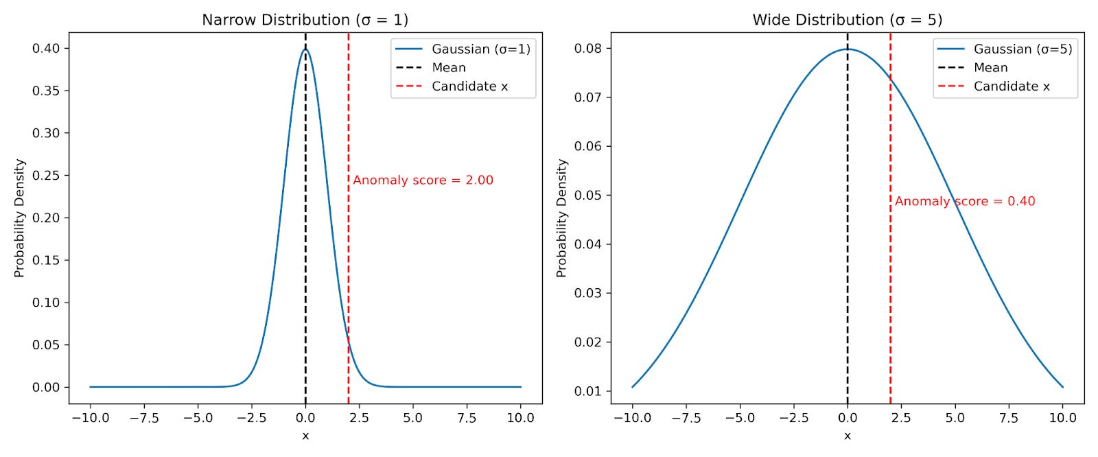
Let’s consider an acquired remotely sensed image in matrix form as X ∈ ℝ^(n × d) where n is the number of pixels and d is the number of channels. If we want to find which pixels are anomalous, or special, relative to the rest, then by definition we can say that we consider most of our pixels to be our ‘background’. How would we then define our anomalies? In the one dimensional case, we might simply take each value, and calculate its distance from the mean of our background distribution. However, we also probably want to scale this distance, by the standard deviation of our distribution: this gives us a z-score which is essentially a distance to the mean measured in standard deviations. If we don't do this scaling: the distance to the mean becomes a little meaningless, as shown in the figure below, where we have two data points that are the same distance from their respective distribution means, but with very different z-scores.
Z-scores are better than straight distances.
How can we extend this to multiple dimensions, notably for our image, to d dimensions, where d is the number of channels? We can extend this analysis by using the Mahalanobis distance, which is a measure of the distance between a point x and a distribution Q. In this case, our point is the point we are evaluating an anomaly score for, and the distribution is our background distribution. We parametrize our background in terms of the empirical covariance matrix Σ. Then we calculate the Mahalanobis distance using the formula:
Where x is a given point we’re evaluating the distance for, and μ is the mean over our data.
Graphically, this means that we are scaling all of our distances to our distribution centroid by the variance in that particular direction. I’ve generated a highly anisotropic 2-D Gaussian, i.e with much more variance along one axis relative to the other. The contours denote iso-density curves of this distribution. The plot below shows two points, blue and red, with the same Mahalanobis distance, but very different raw distances to the centroid.
Something I like a lot about this approach: no training data/labels needed! You are simply mathematically defining an anomaly measure and applying it to your data. If a particular pixel/signature is not picked up, then it is by definition not anomalous (based on this metric), and you should try something else.
The steps to implement this detector are pretty simple, the code I used to generate the figures in this post is contained below:
A final thing to note: in remote sensing, this is typically referred to as the Reed-Xiaoli (RX) Detector, but it’s essentially an implementation of the Mahalanobis distance. The results of our RX detector are shown below: I chose an image from the ‘peace and security’ category, taken near the Suez Canal in Egypt.
Anomaly detection on hyperspectral imagery: highlighted here are some spectrally anomalous bodies of water, well as some interesting detections at an airport. Yellow/bright is more anomalous.
The first thing you’ll notice is that there is inherent spatial structure in our RX scores/detections. This is great news: if you look at the code posted above, you’ll see we do a .flatten() before doing all of our calculations. This means that there is no inherent spatial information fed into our RX detector: everything you can see arises spontaneously via Tobler’s first law of geography, which states that “"everything is related to everything else, but near things are more related than distant things”. In general, if you have deployed a pixel-wise model such as the one described here and your output has spatial structure, you are likely detecting something real, and probably something interesting!
The best way for you to explore these results interactively is to run this colab notebook: it should allow you to pan around, and I’ve overlaid the TOA reflectance RGB and NDVI composites for you to toggle between the RX results and the underlying imagery. Have a look and see what you can find!
For those of you who can’t be bothered to open the notebook: I’ve highlighted a couple of regions in our map I thought were interesting: we can see that there are darker puddles of what appear to be water which are detected as highly anomalous given the context of the image. This is interesting because a large proportion of the image appears to be water, but these areas in particular light up in our RX detections. Perhaps these areas of water have very different spectral properties relative to the sea water in the canal.
I also chose to highlight what appears to be a pivot-irrigated field at Kibrit airport as this patch appears fairly anomalous relative to other fields in our image. Zooming in a little more to the airport, we can see that our anomaly detection has flagged what appears to be a different type of material over the landing strip too. I thought this was a pretty interesting result given that the underlying material appears noticeably different in the high-resolution Google map imagery, as shown below.
Material anomalies at Kibrit Airport.
🌈 Conclusion
So far I’ve shown you how to use the RX detector to find things of interest in wyvern’s imagery. Of course this is the easy part: how do we deploy such a detector, what is a reasonable threshold to return detections, and how do we post-process these detections are questions that one needs to ask at this point. Typically this kind of algorithm will be used as a ‘pre-filter’ to provide detections for validation to a human analyst. I think this is the most important part of most geospatial data science projects to be honest: looking at the data. Just scrolling around the RX map I've found lots and lots of ‘things of interest’ including roads, lakes, anomalous fields etc…, that were not obvious when examining the imagery itself. In the next post, I’ll show you how to extend RX to find anomalous changes and perform change detection between hyperspectral images, so please subscribe so you don’t miss out! We’ll also have a a look at the spectral profiles of areas of interest, which we haven’t really touched on here.
A big thank you to Wyvern for providing this data in the first place, and enabling me to perform this analysis, hopefully we’ll see more of this from imagery providers!